Workshop 24. Visualization.
import pandas as pd
df = pd.read_csv('https://gist.githubusercontent.com/l8doku/d3d8a8dfb55482f3371a517dc8b38d1a/raw/f78cb5cb49f825173b1ca19478fa0ff2d1efad2e/sales.csv')
df.head()
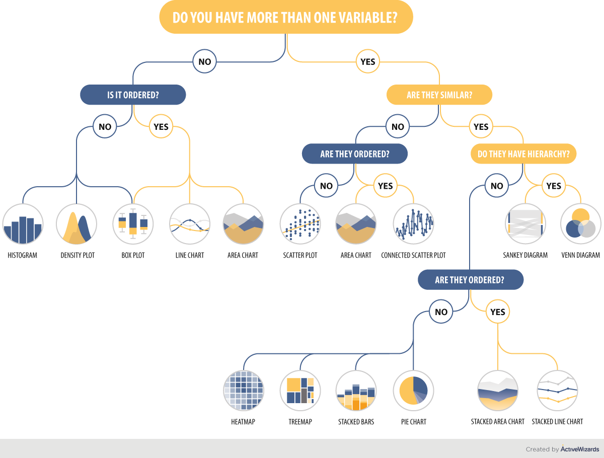
How to choose the right chart type

Matplotlib
# Prepare Matplotlib
import matplotlib.pyplot as plt
%matplotlib inline
# Change the size of the figures
from matplotlib import rcParams
rcParams['figure.figsize'] = 14, 9
Simple plot
# Arguments are x and y coordinates as python lists
xx = [1, 2, 3, 4]
yy = [2, 3, 5, 9]
plt.plot(xx, yy)


# Arguments are x and y coordinates as numpy arrays
import numpy as np
xx = np.linspace(-1, 2, 10)
yy = xx**2
plt.plot(xx, yy)

# If the first argument is missing, [0, 1, 2, 3, 4, ...] will be
# used automatically
plt.plot(yy)
Subplot
Function plt.subplot() lets you have multiple graphs on the same picture.
plt.subplot(nrows, ncols, index) specifies that you will have nrows by ncols grid of plots, and right now you choose subplot number index (starting from 1, until nrows*ncols)
# Specify that you will have subplots:
# 2 rows, 1 column, now drawing in the first (top) one
plt.subplot(2, 1, 1)
xx = np.linspace(-1, 2, 10)
plt.plot(xx, np.sin(xx))

# If you don't have many plots, you can write all three arguments as one number
# Now drawing in the second one
plt.subplot(212)
plt.plot(xx, np.cos(xx))
# Arguments are data columns (series)
# Format is 's', means "don't draw lines, draw square markers"
plt.subplot(311)
plt.plot(df.salary, df.sales, 's')
# Exactly the same as above, but circle markers
plt.subplot(312)
plt.plot(df['salary'], df['sales'], 'o')
# Arguments are data frames
plt.subplot(313)
plt.plot(df[['salary']],df[['sales']], '.')
Multiple columns in Y
Slight problem is you have to assign legend labels manually
plt.subplot(211)
x = [1, 2, 3]
y = [[1, 2, 3],
     [4, 5, 6],
     [7, 8, 9]]
plt.plot(x, y, 'o')
plt.subplot(212)
plt.plot(df[['salary']],df[['training level', 'work experience']], 'o')
plt.legend(['training level','work experience'])
Histogram
# default histogram
plt.subplot(311)
plt.hist(df.salary)
# More bins: more details can be seen, but the histogram is more random
plt.subplot(312)
plt.hist(df.salary, bins=30)
plt.ylabel('Number of appearances')
# density makes a histogram count items relative to each other
# instead of counting the number of appearances
plt.subplot(313)
plt.hist(df.salary, bins=30, density=True)
plt.ylabel('Density')
You can compute the values of a histogram with numpy and then use plt.bar(positions, height) to draw the histogram bars
# Drawing a histogram manually

# compute histogram with numpy
# output is heights of bins (n values) and edges of bins (n+1 values)
height, edges = np.histogram(df.salary)
# Remove the last edge to have n values
# Now each edge corresponds to a bin, and is a left edge of the bin
left_edges = edges[:-1]
# Compute the width of a bin as difference between any two edges
width = edges[1] - edges[0]
# Arguments are:
# bar positions, bar heights, bar width (a single number), alignment
# Default alignment is 'center'
# We have left edge positions, not center positions, so use 'edge' here.
plt.bar(left_edges, height, width=width, align='edge')

# You can also use these values for any other kind of plot
bin_centers = left_edges + width/2
plt.plot(bin_centers, height, 'r')
Pie chart
import matplotlib.pyplot as plt

# Pie chart, where the slices will be ordered and plotted counter-clockwise:
labels = 'Frogs', 'Hogs', 'Dogs', 'Logs'
sizes = [15, 30, 45, 10]

fig1, ax1 = plt.subplots()
ax1.pie(sizes, labels=labels, autopct='%1.1f%%', startangle=90)
ax1.axis('equal')  # Equal aspect ratio ensures that pie is drawn as a circle.
# autopct puts labels inside the chart

plt.show()
Some additional Seaborn examples
import seaborn as sns
sns.set_theme()
# Adding hue argument to pairplot
sns.pairplot(df, hue='level of education')
# jointplot as a more complex scatterplot
sns.jointplot(data=df, x="salary", y="sales", hue="level of education")
# lmplot as a more complex scatterplot
sns.lmplot(data=df, x="salary", y="sales", hue="level of education")
Tasks
Task 24.1
Plot how salary depends on level of education. Use catplot and boxplot from Seaborn.
Task 24.2
Plot 3 pie charts showing the distribution of division for the following cases:
- All employees
- Education is 'high school'
- Salary is less than 100000
# useful methods:
print(df['level of education'].unique())
sales_index = df['sales'] < 200000
print(sales_index.sum())
Task 24.3
Use parameters col and row of seaborn plot functions to plot a grid of salary/sales plots.
Each separate figure in the grid should be filtered by division and level of education.
Task 24.4* (same as workshop 23, task 10.2)
Plot the same graph as in task 24.1 but remove the outliers - the values of salary that are too far away from the average.
Remove those who are more than 2 standard deviations (.std()s) away from the mean.
Task 24.5*
Compute average salary for each combination of work experience and level of training.
Plot the resulting rectangle matrix as a heatmap.
If there is no data for some combination of work experience and level of training, fill that value with 0 or NaN.